中台神學院歡迎您!


中台簡介
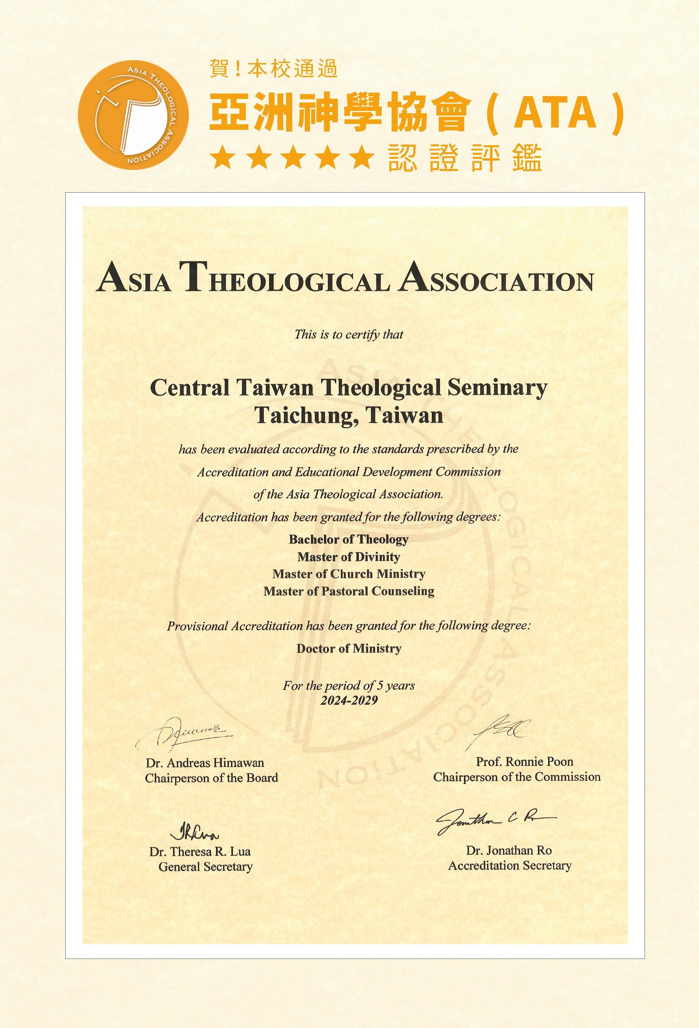
ATA認證
Template Details
All JoomlaShine templates can be effortlessly configured by template parameters. In template setting page, you will find 40+ template parameters arranged into logical groups for convenient operation.

Set parameters without confusion
Most parameters are designed that way that you can simply select options without confusion about what value to define. All parameters are equipped with description text for easier understanding.

Parameters to control layout dimensions

Parameters to control colors & styles
In our templates all wordings of both back-end and front-end are moved to separated language files, so you can easily translate them into any language you want.
Interactive images presentation by JSN ImageShow extension
Currently our templates support more then 10 languages and more to be come in future.

English

German

Dutch

Italian

Spanish

French

Japanese

Danish

Russian

Polish

JSN Medis is natively compatible with both Joomla! 2.5 and Joomla! 3.x. The installation package is compatible with both Joomla CMS.

In Customer Area, you can choose to download appropriate installation file for the Joomla! version you are using.
All JoomlaShine.com templates have special built-in design optimized for modern mobile devices iPhone, Android and Windows Mobile-based. The responsive design is applied for both Joomla 2.5 and 3.0 versions, and for Pro Edition only.
Unlike other template providers, we do not develop something that looks like a mobile app with heavy menu and animation. We built compact and lightweight version of the template preserving the whole original look-and-feel.
Mobile layout overview on Iphone

Mobile layout overview

Module positions in mobile layout
As default, all modules will be displayed on both desktop and mobile. To display a module on only desktop or on only mobile, you can add Module Class Suffix parameter as following:
- Display a module on only desktop: display-desktop
- Display a module on only mobile: display-mobile
Mobile layout overview on Ipad

Mobile layout overview on Ipad
Optimized HTML overrides for mobile

Article presentation (com_content)

News feeds presentation (com_newsfeeds)
We optimized HTML overrides for all default Joomla! extensions to make them looks neat in mobile edition. The work is mainly focused on rearrangement content from columns to rows.
Optimized menu for mobile
For mobile edition, we have built very simple, yet effective menu system, where all children menu items are presented as tree in collapsible panel. This menu system utilizes only little Javascript (MooTool) for expanding/collapsing submenu panels and is very fast and lightweight.

Special designed mobile menu system

Children menu items are presented as tree
Mobile Menu with icons and rich text
The most amazing thing is mobile menu inherits all the goodies of regular menu like icons and rich text.
Mobile menu with icons applied

Mobile menu with rich text
The responsive feature is enabled on live demo. You can check this by resizing the demo to the desired size and see how it presents on mobile devices.
焦點專區
教博科2026冬季課程


活動專區


推廣【延伸神學證書科】選課報名

重要消息

受理報名至12月29日(週一)截止
受理報名至2026年2月9日(週一)截止

1月9日(週五)前完成報名繳費者8折

教牧博士科
2025教牧博士科
教牧博士科
教牧博士科


聯絡資訊
- 文章瀏覽點擊數
- 29928097
快速選單
教務處

推廣處